
FORESIGHT
A personal budgeting app to help you get a better view of your money.
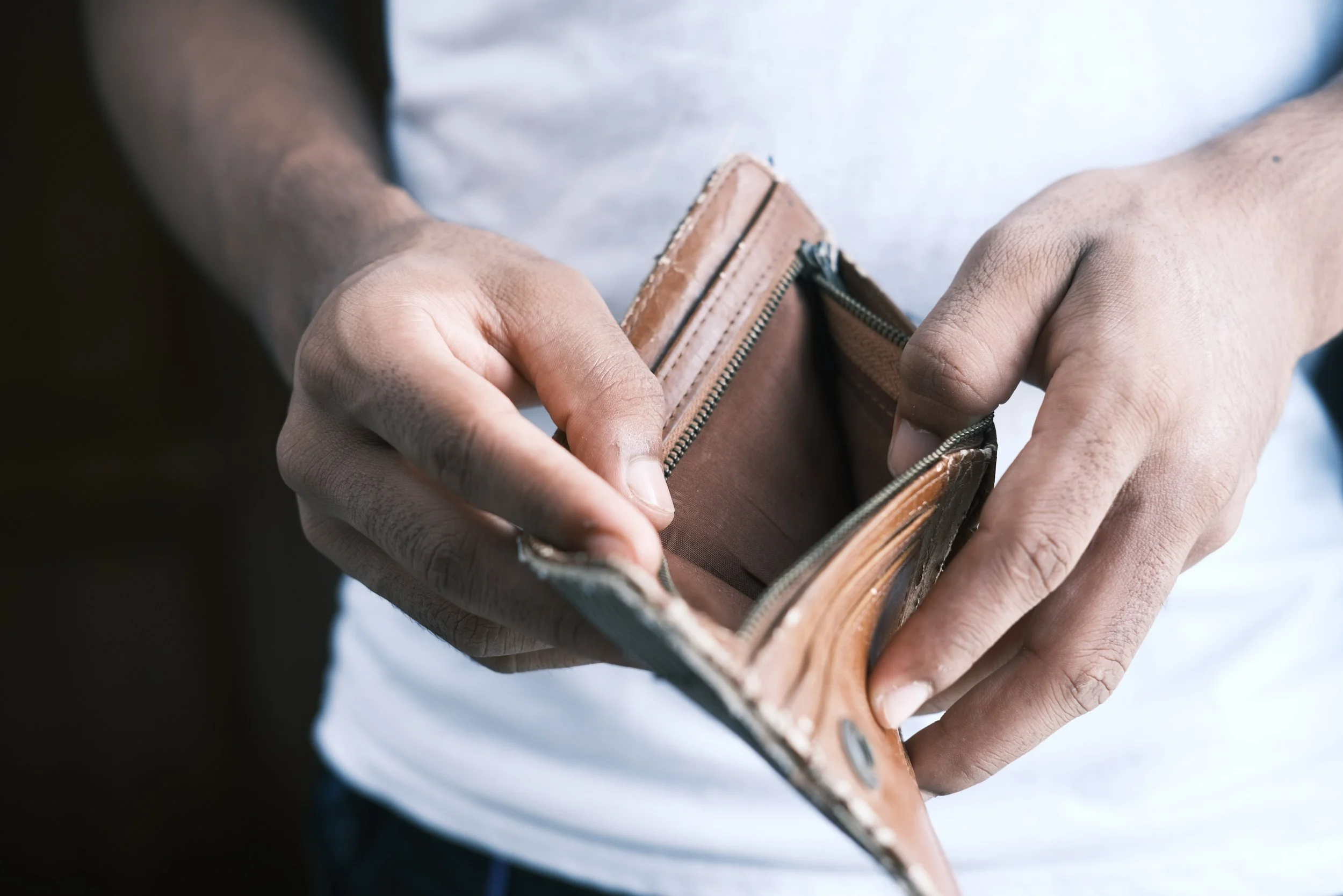
Problem
People start a budget when they experience a significant life event but don’t stick with it. There’s an opportunity to make budgeting manageable and educate people about finances.
Roles
I was directly responsible for all aspects of this project, from research and user interviews to prototyping and visual design.
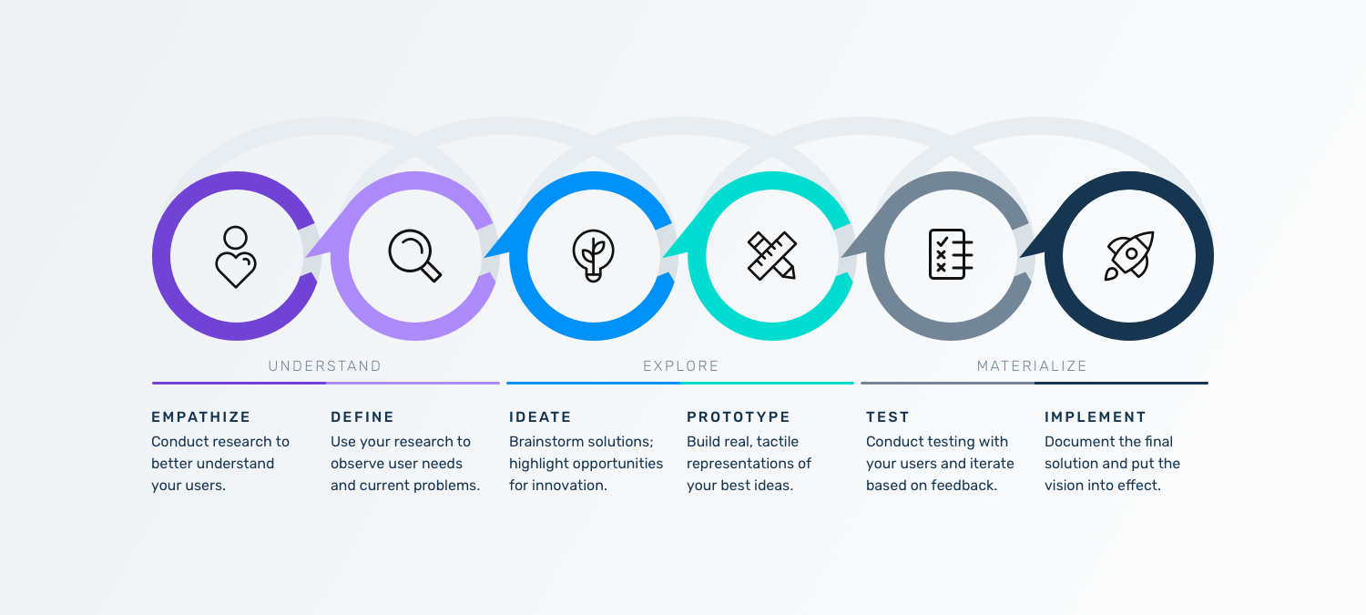
Methodology
The Design Thinking Method of Empathize, Define,
Prototype, Test was the framework for my project.
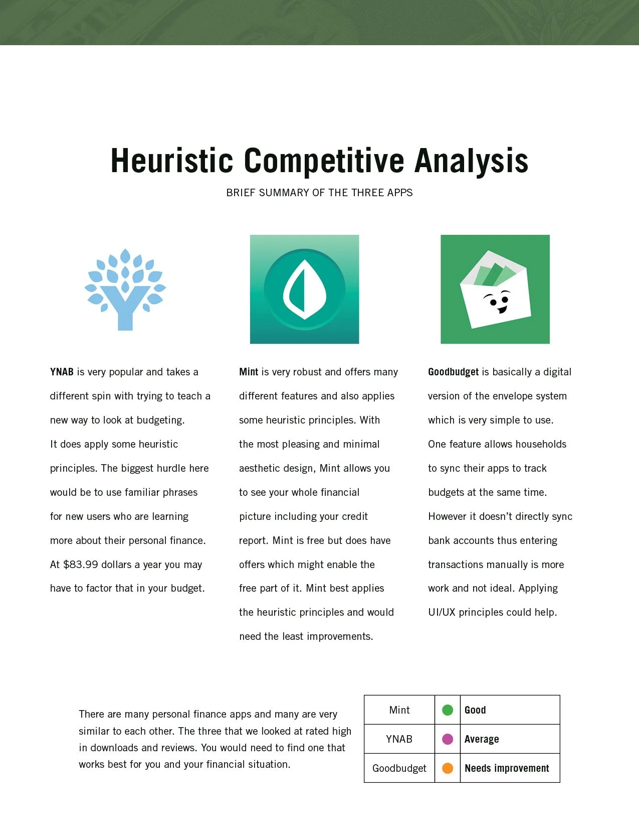
Empathize: Competitive Analysis
Based on high downloads and good reviews, I compared three apps using the Heuristics of Aesthetic and Minimum Design the Match between System and Real World and User Control and Freedom.
All three apps didn’t offer much in the way of educating their users about their money and financial planning.
Empathize: Screener Survey
The Screener survey allowed me to get some great insights into people’s behavior.
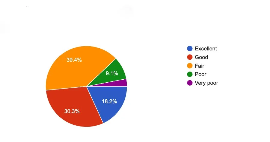
Q: How do you describe your knowledge of budgeting?
In my research I learned that close to 50% of respondents described their knowledge between fair and poor so education is an area where financial apps can clearly improve.
Based on 33 responses.

Q: How did you learn
about budgeting?
Close to 58% of people learned on their own.
This question supported the assumption that people
are looking to learn more about their money.

Empathize: User Interviews
The screener survey uncovered some good questions for me
to explore that reiterated the need for the user to learn more about budgeting.
“It would be good to have an
educational element built into it.”
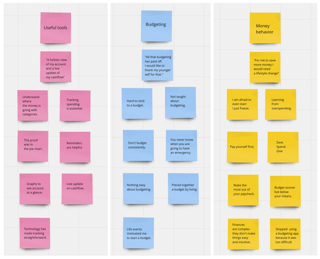
Define: Affinity Map
Some key insights from the five people I interviewed:
• People don’t consistently budget and they need to be
engaged with the app to keep using it.
• People were not taught about budgeting, so there
seems to be a lack of how to do it.
• People get overwhelmed because budgeting apps
are not always intuitive.
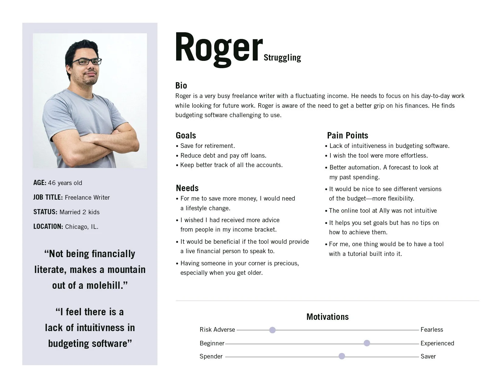
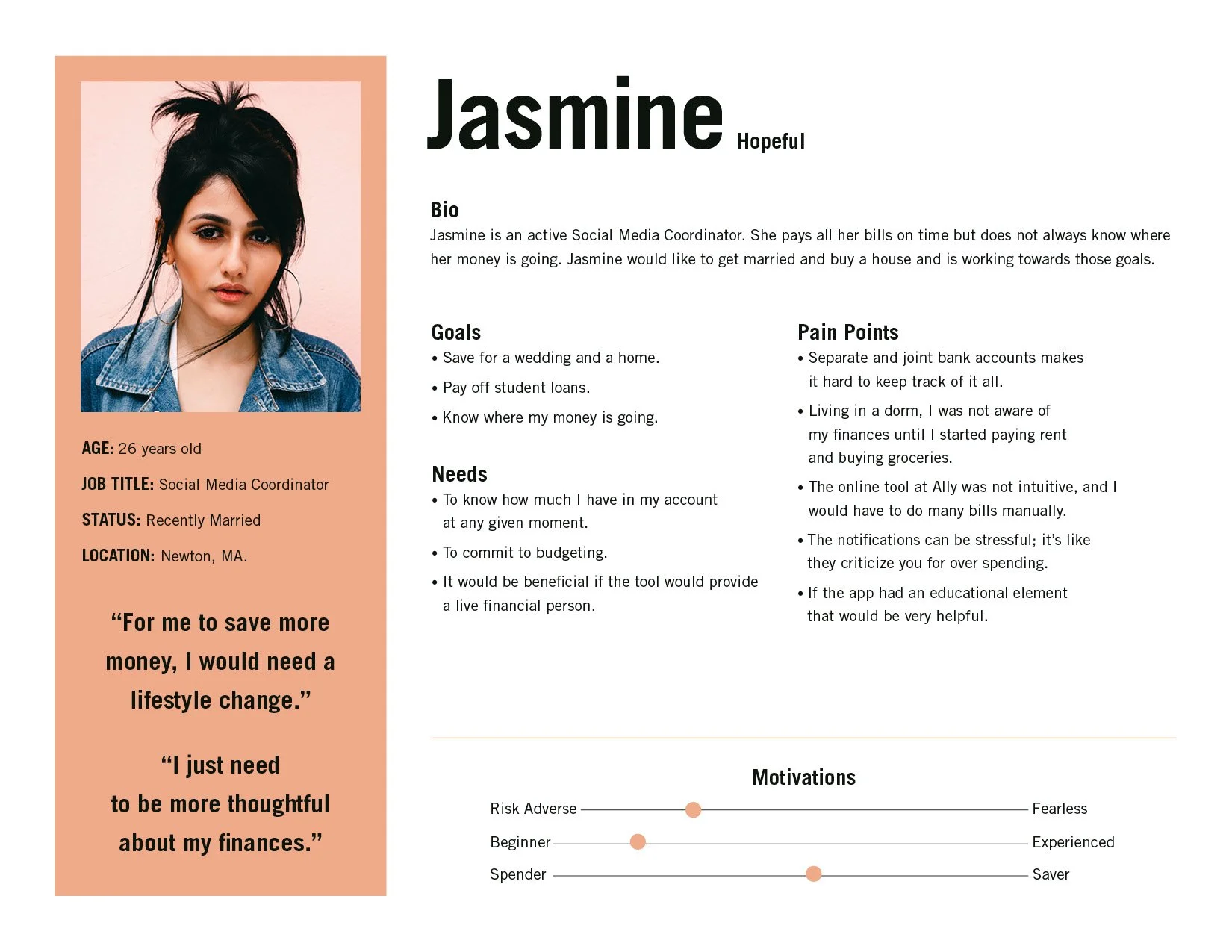
Define: User Personas
From the patterns through the Affinity Map, I was able to identify two different personas. Roger Struggling, who is older but has never got a handle on his money, Jasmine Hopeful, who is starting out and realizes her responsibilities in life require a budget.
Ideate: How Might We:
The insights that I gathered from the interviews and affinity maps helped me to develop the HMW’s
HMW: Set financial goals and achieve them?
HMW: Make it easier to track your money?
HMW: Ease the fear of creating a budget?
HMW: Educate people about their money?
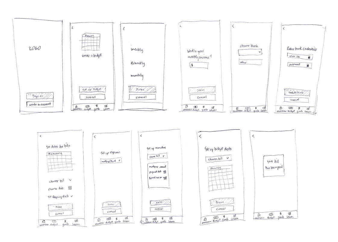
Ideate: Sketches
Based on what I had learned from research, I created sketches to conduct “guerrilla” testing using with 5 users.
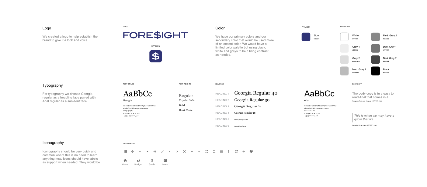
Ideate: Style Guide
Since the nature of finances is complicated, I wanted to convey simple graphics with a limited color palette. I choose blue because it reflects honesty, stability, and authority. The user doesn’t want to feel overwhelmed.
Prototype:
The research led me to create something as simple as possible where the user would be engaged to want to take control over their finances.

It was essential to have learning features like Foresight Facts that would give you timely information
and the Learn Section with more in-depth articles to make better informed financial decisions.
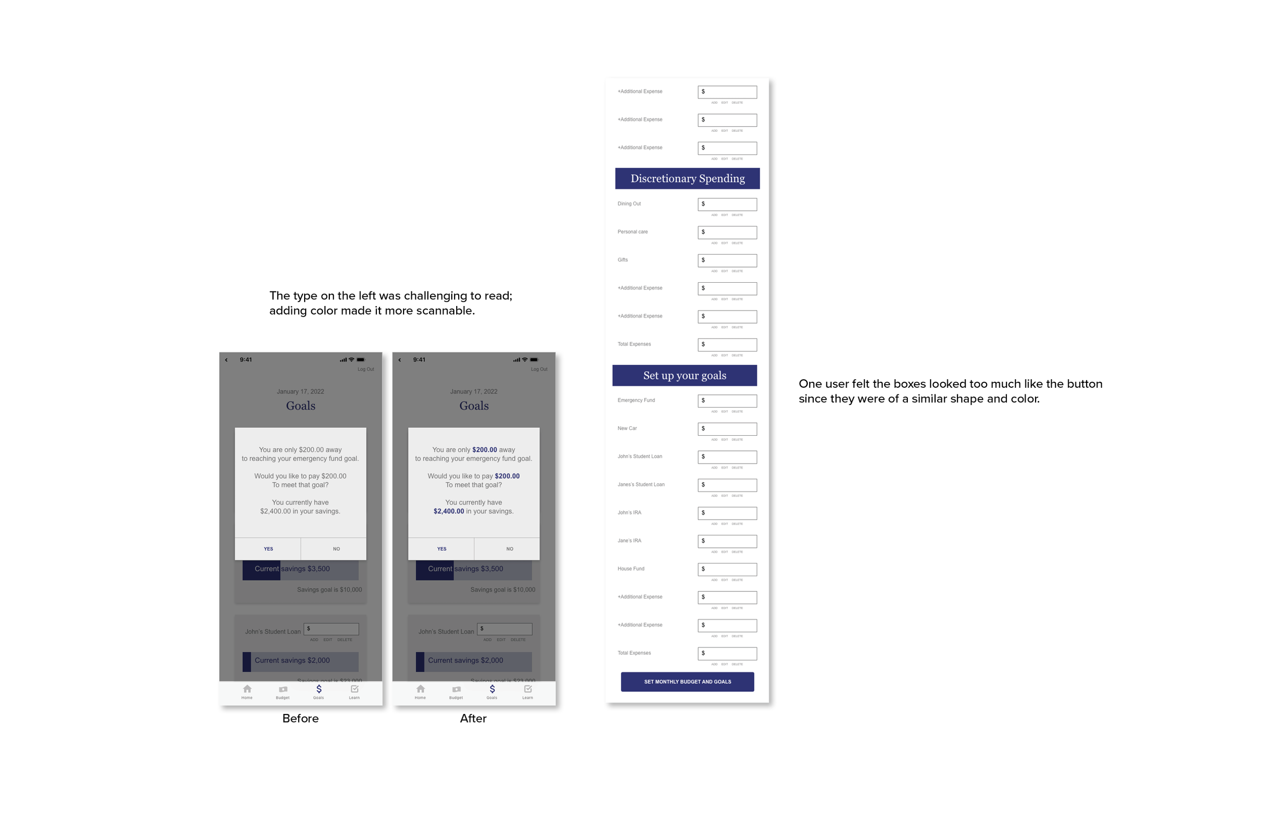
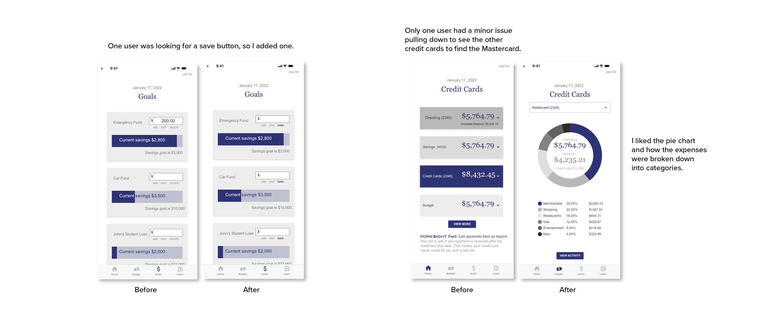
Testing: Usability Testing
Some of the tasks I asked to see if users could perform in order to accomplish their goals.
Can you tell me the available balance of your checking account?
4/5 people were able to accomplish this task with ease.
What category did you spend the most money with your Mastercard credit card?
There was some confusion of how to check the balance. Some people did not recognize the drop-down menu.
How would you remove a second income from your budget?
The removal process could have been more obvious.
How would you meet you goal of funding your emergency fund?
This was the most involved of the task but pop-up prompts helped guide the process.
Testing: Usability Testing Results
I learned the value of identifying problems, reiterating and retesting.
Learnings and reflection
What worked:
Conducting research interviews was a fun way to learn
about the user’s money behavior.
What didn’t work:
I fell victim to my own biases and had to redirect
myself back to think about the user.
What would I do next time:?
I would ask better questions to really take advantage of the the users
I interviewed. I would conduct more usability testing throughout the process to ensure I was on strategy.